大家好啊,最近我在重读苹果的 HIG 了,因为内容比较多,我也想读完后有个比较好的吸收,初步计划是:读第一遍后的感受就发到 newsletter 上,这是第一篇。
另外,因为我是交互设计师,所以会更侧重于输出「交互设计」方面的观点,视觉侧的话,我推荐关注这位朋友的 newsletter : Design Scenes Weekly (zhubai.love)
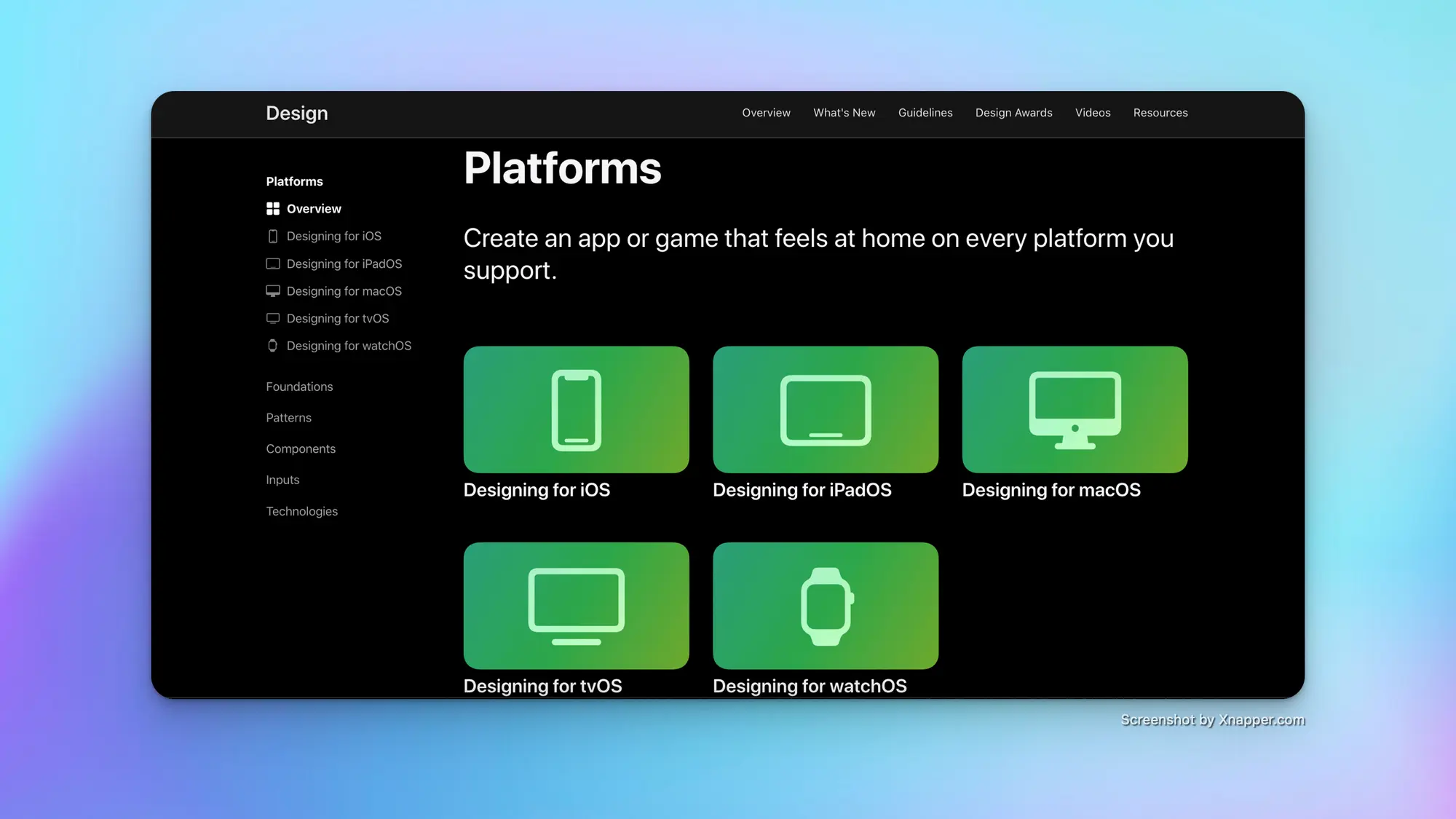
「平台」
原文地址: Platforms - Platforms - Human Interface Guidelines - Design - Apple Developer
介绍指南适用的各个端,一个卡片对应一个端的OS,里面介绍了不同设备的特征,并建议设计师和开发者根据这些特征展开设计或开发。
iOS
Enable interactions that support the way people usually hold their device. For example, it tends to be easier and more comfortable for people to reach a control when it’s located in the middle or bottom area of the display, so it’s especially important let people swipe to navigate back or initiate actions in a list row.
这段内容中提到了控件所处位置对于用户访问易用性的影响,当控件位于显示屏的中间或底部区域时,用户访问控件往往更容易、更舒适。因为这符合了用户握持设备的姿势习惯。
iPadOS

Inputs.
• People can interact with iPad using Multi-Touch gestures and onscreen keyboards , an attached keyboard or pointing device , Apple Pencil , or voice , and they often combine multiple input modes.
• Let people use Multi-Touch gestures, a physical keyboard or trackpad, or Apple Pencil, and consider enabling unique interactions that combine multiple input modes.
这段内容提到了 iPad 上允许人们使用复合的交互,并建议让用户多点触控手势、物理键盘或触控板或 Apple Pencil ,并考虑启用组合多种输入模式的独特交互。但我其实并不苟同这个建议,就我个人使用12.9寸 iPad Pro 的体验来说,我认为 iPadOS 的交互还是过于复杂了,物理控件操作虚拟界面,虚拟控件操作虚拟界面,多种多样的任务窗口,用户要在不同的交互方式之间进行切换,难道这样真的能增加操作效率吗?至少易用性我会打个问号,但我可以给予肯定的是,足够大的触摸屏,能够带来阅读上的效率提高。
macOS
关于 macOS 介绍的这部分,大致上比较基础,但有两个地方我会比较在意:
第一点是 Mac 用户可能会长时间专注在处理任务上,为了提供足够效率的体验,我们在设计的时候,应该允许应用窗口支持两种过渡:活动与非活动、全屏与调节窗口大小;
第二点是键盘快捷键,在 macOS 的应用中,建议通过快捷键帮助人们加快操作速度,并支持纯键盘工作方式。
tvOS
Ergonomics.
Although people generally remain many feet away from their stationary TV — often 8 feet or more — they sometimes continue to interact with content as they move around the room.
App interactions.
People can get deeply immersed in a single experience — often lasting hours — but they also appreciate using a picture-in-picture view to simultaneously follow an alternative app or video.
针对 tvOS ,以上两点我比较在意:
第一点提到了人们在与 tv 交互的时候,可能会处于一个「运动」状态,典型场景是健身,我们在设计的时候要考虑到用户在运动时,注意力不连贯的情况,继而考虑设计方案:比如在画面中让元素集中,抓住用户的中心注意力;或者增加更多的声音反馈,以提高用户的参与感。
第二点提到了 tvOS 应用的多任务情况,通常用户会在 tv 上聚集一个主任务,但他们也可以通过画中画的方式让其他任务放在画面中。
watchOS

• Enable quick, glanceable interactions that deliver critical information succinctly and help people perform targeted actions with a simple gesture or two.
• Use notifications to deliver timely, high-value information and enable important actions people can take without opening your app.
最后针对 watchOS 上的这两点,让我比较在意:
第一点中提到需要给用户提供可快速完成的交互,因为用户通常在手表上交互的时间不会超过一分钟(以我的习惯,甚至在10秒内),所以提供简洁而且容易发现的操作,是设计的重点之一;
第二点提到了「通知」设计的重要性,用户常常通过 Apple Watch 获取来自 iPhone 上的通知,并且执行下一步操作;因此,通知信息简短,且提供可轻松点击的操作按钮,能够帮助用户快速处理在手表上的任务。
小结
虽然这一章是 HIG 的入门章节,基本上就是简单介绍各个平台的显示以及交互特性,我也从中就我感兴趣的部分写下了想法;也恰恰因为是入门内容,常常会被人忽视,所以我才要特地开一页,让人看了也能从较短的内容中获取启发。
感谢你的阅读。
其他你可能感兴趣的:
我的小报童: 24PX (xiaobot.net) 只谈垂直的交互设计内容,目前已有 42 位朋友订阅,感兴趣可以试试先订阅三个月,欢迎留言、催更。
关于我的个人说明书: https://jefferyho.feishu.cn/docx/doxcnVqGSo1JtD5XryxvTwakj9c