Layout 布局
原文地址:
https://developer.apple.com/design/human-interface-guidelines/foundations/layout
A safe area defines the area within a view that isn’t covered by a navigation bar, tab bar, toolbar, or other views a window or scene might provide. Safe areas are essential for avoiding a device’s interactive and display features.
安全区域定义了视图中没有被导航栏、选项卡栏、工具栏或窗口或场景可能提供的其他视图覆盖的区域,它对于设备的交互和显示功能至关重要。
Use placement to convey relative importance. In general, place principal items in the upper half of the screen or window, near the leading side. People typically start in this area, whether they’re looking at the screen or using a screen reader like VoiceOver.
使用位置来传达相对重要性。一般情况下,将主要项目放在屏幕或窗口的上半部分,靠近前面一侧。人们通常从这个领域开始,不管他们是看着屏幕还是使用像 VoiceOver 这样的屏幕阅读器。
嗯,这个符合了人们的阅读习惯。
Elevate essential information by giving it sufficient space. People want to view the most important information instantly, … People can easily access secondary information by scrolling.
通过给予足够的空间来提升重要信息。人们希望在第一屏上立即查看最重要的信息,而次要信息,他们可以通过滚动屏幕进行查看。也就是说,我们在设计界面时,需要充分考虑什么信息是主要的,将它们放在第一位,而次要信息可以适当往下放。
When possible, consider alluding to hidden content by partially displaying offscreen elements.
在可能的情况下,考虑通过部分显示屏幕外的元素来暗示隐藏的内容。
Platform considerations
If it’s essential that your app run in a single orientation, don’t tell people to rotate their device to match; if your app doesn’t rotate automatically when someone holds the device in an unsupported orientation, they’ll know instinctively to rotate it.
对于横屏布局和竖屏布局的考虑,比较重要的一点是,如果你的应用程序必须以单一的方向运行,不要通过设计来暗示用户,他们可以旋转屏幕后继续使用。
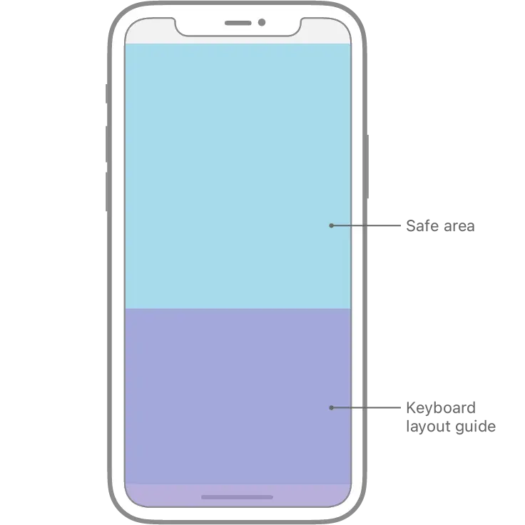
iOS keyboard layout guide
iOS 15 引入了 keyboard layout guide(键盘布局),可以帮助开发者更方便地计算弹出键盘后的安全区域布局,如下图为键盘弹出和收回时安全区判断。做设计时如果是指定了常驻底部的元素,那么弹出键盘后如果指定该元素依然浮在键盘上方,开发设置安全区底部绑定键盘区顶部即可。

TVOS
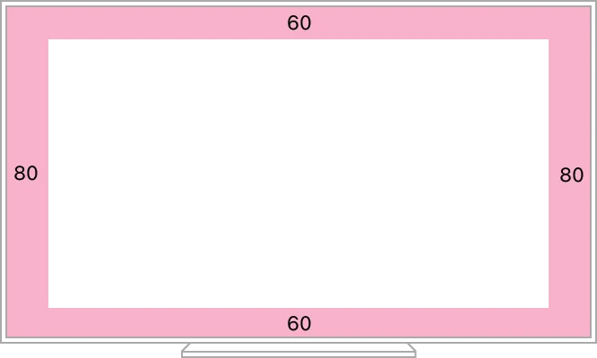
It can be difficult for people to see content that close to the edges, and unintended cropping can occur due to overscanning on older TVs.
人们很难看到接近边缘的内容,并且由于在旧电视机上可能由于分辨率不足导致画面放大,可能会对内容发生意外的裁剪。因此,在tvOS中,画面的安全区至少是两侧保留80px,上下两端保留60px
watchOS
Avoid placing more than two or three controls side by side in your interface.
As a general rule, display no more than three buttons that contain glyphs — or two buttons that contain text — in a row. Although it’s usually better to let text buttons span the full width of the screen, two side-by-side buttons with short text labels can also work well, as long as the screen doesn’t scroll.
避免在界面中并排放置多于两个或三个控件。在Apple Watch这个寸土寸金的屏幕中,一行中显示不超过三个包含符号的按钮ーー或两个包含文本的按钮。使用通栏的按钮通常来说会更好操作,但是两个并排的带有短文本标签的按钮也可以很好地工作,因为这样的话就不需要用户进行滚动操作。
Support autorotation in views people might want to show others.
当人们希望向他人展示屏幕内容时,支持自动旋转屏幕。比如说,在使用 watch 二维码支付的场景中,自动旋转屏幕方向,可以方便收款方更好地识别屏幕内容。
Materials 材质
原文地址:
https://developer.apple.com/design/human-interface-guidelines/foundations/materials
材质这一章比较简单,只讲几点:
What 是什么
一种视觉效果,在系统中通过在文本、图标的背景上,向界面下一层的背景提取颜色并显示出来,通常是毛玻璃效果,以达到增强画面的深度感。
系统的背景层分为了语义化的四种:透明度由低到高为 Thick、Regular、Thin 和 Ultrathin , 其中 Regular 为默认。
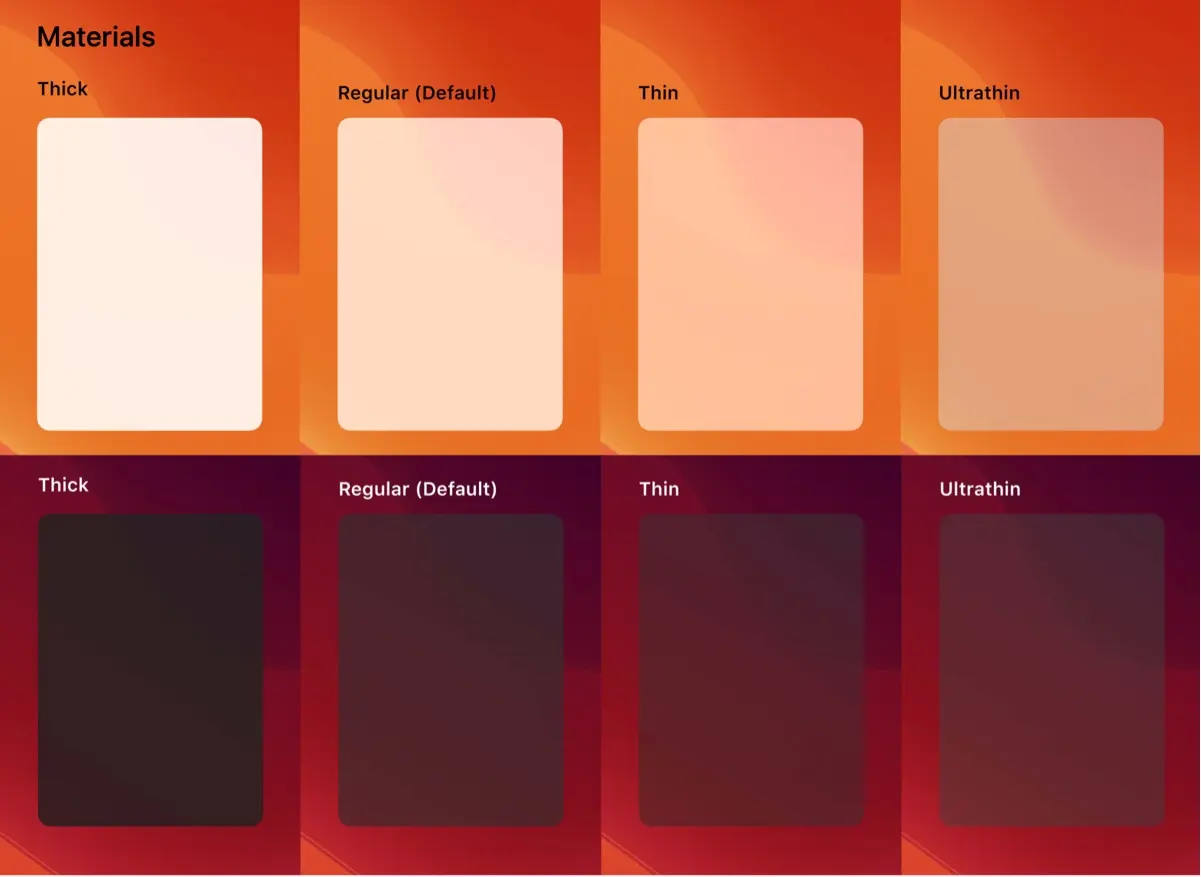
图源:@fenx
Why 为什么
Materials can combine with vibrancy to add visual interest to the interface.
材质可以与活力结合,增加界面的视觉趣味。
Where 用在哪里
iOS、iPadOS上的原生对话框、提示
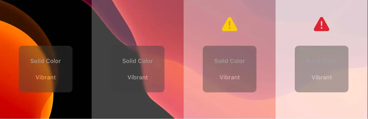
图源:@fenx
watchOS
暂不支持这个材质效果。
macOS
在macOS中有两种混合模式,一种在窗口背后,另一种是和窗口融合。

这是第一种,在这种模式下,窗口后面的内容会显示出来,帮助用户保留围绕你的应用程序或游戏的一些上下文。菜单、工作表和侧栏等组件自动使用此模式。
这是第二种,在这个模式下,允许通过其他窗口组件显示窗口内容。例如,当窗口内容在工具栏下滚动时,工具栏可以使用这种模式,给人一种连续性的感觉。
tvOS
定义和iOS类似,没有过多展开。
💡 对于移动端app的产品设计师来说,这一章内容派上用场的地方并不多,能够理解官方对于毛玻璃材质的四种定义就足够了。
我最近建了一个电报群,分享日常看到的产品体验设计,开了一个星期,目前是91位朋友订阅了这个频道,可以看看: https://t.me/twentyfourpixelschannel