
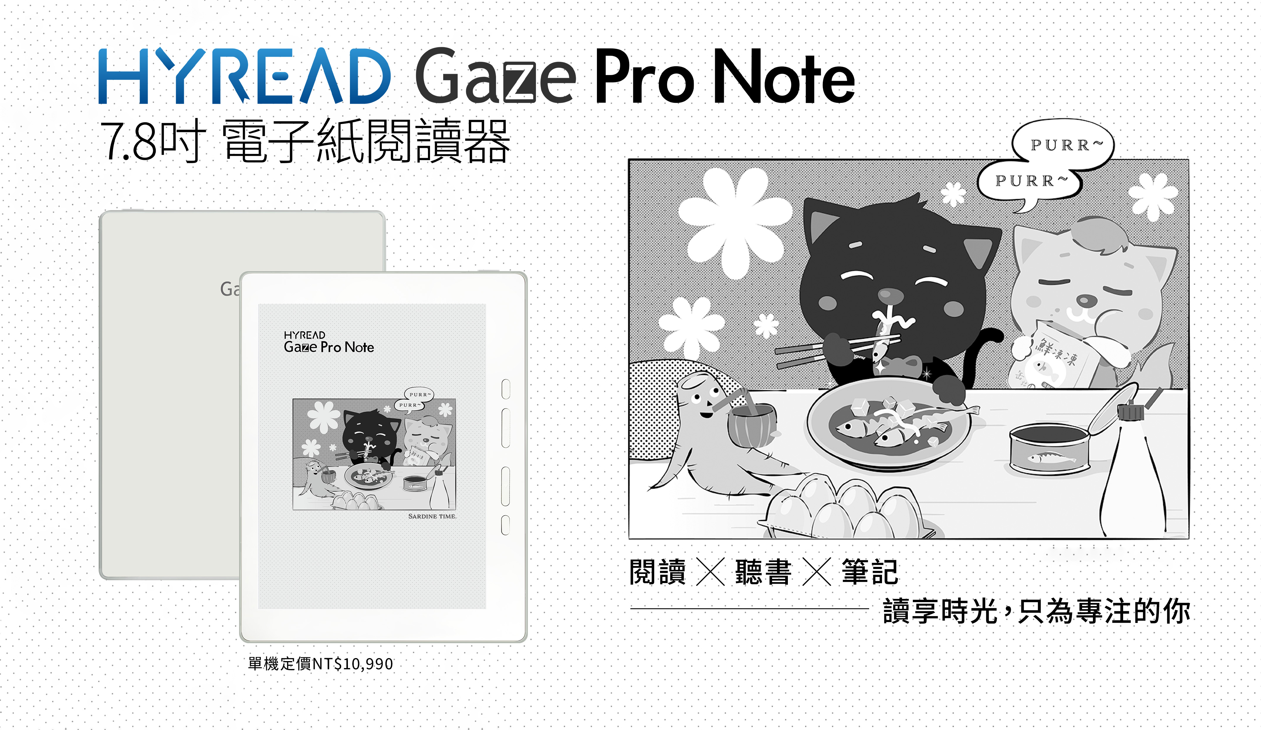
Recently, I bought a new e-book reader: HyRead Gaze Pro Note 7.8-inch full flat e-paper reader, for three reasons:
- I purchased a Kindle Voyage in Japan back in 2017, and after nearly eight years of use, the rubber strip on the lower-left edge of the screen has come loose. It now feels a little uncomfortable to hold, so I decided it might be time to try a new device.
- During my nightly runs, I use the Moon+ Reader Pro app on my Android phone to listen to books via its text-to-speech feature. When I get home and switch to the Kindle, I have to manually search for my last reading position, which wastes time on syncing.
- With an open system e-reader, I can install and use Moon+ Reader Pro, allowing automatic sync between phone and reader (via Dropbox).
I’ve been using it for about a week, so here are my thoughts on the differences compared to the Kindle and Kobo.
1. First Impressions of HyRead
The HyRead Gaze Pro Note has a 7.8-inch screen, compared to the Kindle’s 6-inch and Kobo’s 7-inch screens. It’s slightly larger, meaning I can only grip the narrow edge with one hand. For those with small hands, it’s difficult to hold with one hand, so two-handed use is necessary.
1.1. Applying for a GSF ID
Google Play is pre-installed, but after logging in, the device shows the message “This device is not Play Protect certified.” You need to apply for a GSF ID (Google Service Framework ID) and register the device to pass the certification check by following these steps:
- Go to Settings → Other Settings.
- You’ll see a message saying the Android ID has been copied to the clipboard.
- In the Android ID input field below, long press and paste, then tap register.
- The system automatically converts it to a decimal code. If a decimal code appears, the application has been made successfully.
- Wait one to two days for Google’s review. Once approved, Google Play will function normally.
1.2. Reading Settings
- Open the personal library app, tap the center of the screen, then the gear icon at the bottom right to access reading settings.
- Tap Advanced Settings: select options based on your reading habits.
- Tap Global Layout Settings below: check the option to apply settings to all books so you don’t have to configure each one separately.
1.3. Problems with the Gaze Reading App
Before Google Play was accessible, I tried reading with the built-in Gaze reader using my self-made ePub files. I found that when switching chapters via the table of contents, the jumps were inaccurate—for example, selecting Chapter 10 would bring me to a point before that chapter. Only when keeping the font size (level 3) and typeface unchanged would it jump correctly.
This was surprising—HyRead has been on the market for years, yet such a basic feature still has issues? Has no user reported this before? I emailed customer service, and they simply said they would forward this to the engineers.
2. Reading Experience Comparison
2.1. Font Size Settings
Kindle still offers a better reading experience. It has preset themes that allow saving multiple style configurations. This is particularly useful when switching between reading with glasses or without, as font size preferences change—having saved settings allows quick switching.
Kobo and HyRead, as well as Moon+ Reader Pro, lack options for multiple saved configurations, meaning you must adjust the font size manually each time, requiring several taps to reach your preferred setting.
2.2. Page Layout
Kindle pages are consistently full. Kobo often has varying line counts per page, with a third or even half of the page’s lower area left blank, making each page look inconsistent.
HyRead Gaze and Moon+ Reader Pro fall somewhere between the Kindle and Kobo, with fewer cases of large blank areas at the bottom.
3. Moon+ Reader Pro Settings
Since my e-reader is black-and-white, HyRead displays in grayscale. To optimize reading, I set up Moon+ Reader Pro as follows:
3.1. Visual Options
- Load the theme Day 1 (Pure White).
- Font color: pure black (0, 0, 0, 255).
- Background color: pure white (255, 255, 255).
- Background image: none (choosing background color over background image avoids black dots appearing behind text).
- Font name: custom font (connect the reader to a computer, create a
cfontsfolder in the HyRead root directory, and copy font files there).
3.2. Control Options
- Screen orientation: portrait (sensor-based).
3.3. Other Options
- Keep one line when turning pages: unchecked.
- Open the last read file at startup: checked.
- Show mini status bar while reading: checked and configured.
- Pin status bar to top: unchecked.
- Show battery/time: unchecked (use HyRead’s settings for these).
- Show reading progress: checked; total pages and chapter pages both checked.
- Show current chapter: checked.
3.4. HyRead Refresh Settings
- Swipe down from the top of the screen to show the control panel → tap refresh settings → display settings.
- Image 256 grayscale mode: unchecked to remove grayscale.
- Contrast: set to the far-right (80) for maximum contrast.
Increasing contrast makes grayscale images pure black and darkens grey backgrounds, but Moon+ Reader Pro’s text becomes sharper and easier to read.
4. Conclusion
I haven’t tried HyRead’s signature library feature yet, but I hope it opens a new window into the wonders of technology.
Overall, after a week of use, I’m fairly satisfied with the HyRead. I’ll continue using it longer to see if it can replace my Kindle.
5. 💡 Related Links
✅ Explanation article (Traditional Chinese): https://jdev.tw/blog/8949/
✅ Explanation article (English)
✅ Explanation article (Japanese)